Simple Mode: Gimmick or Good?
Different versions of simple modes on websites are popping up. Is it a trendy UI flex that we include to check-box accessibility, or does this actually help people?
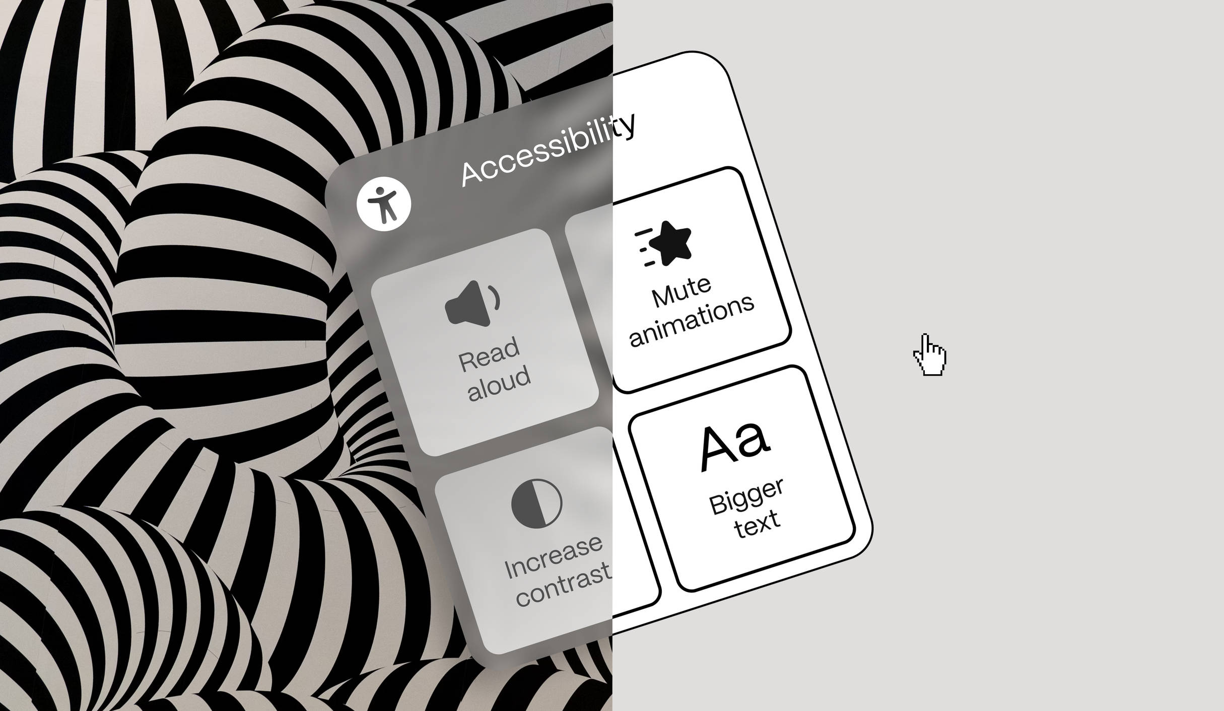
I've seen many of them emerge over time—small menus or popovers highlighting accessibility features on websites. These features include activating a read speaker, increasing contrast, or adjusting type size to assist those who might need it. Some of these features strip the original design of its flair, such as animations, custom typefaces, and color palettes, to create a simpler version that works better for those who struggle with more dynamic or unconventional digital environments. Now coined, by us, as simple mode.
The Right Thing to Do
Simple mode and other accessibility features seem like the right thing to do. We want to be inclusive and ensure everyone can easily use the products and services we create. It's about making sure no one is left out, and everyone can engage with our digital spaces without a hitch. However, over the years, we've learned that people with severe disabilities often have device settings or other assistive technologies that address these needs.
For instance, many individuals rely on built-in accessibility features on their devices, such as screen readers, voice commands, and text-to-speech functions, to navigate the web seamlessly. These tools are tailored to their specific needs and preferences, providing a consistent experience across different websites and applications.
Centralized approach
In some cases, we've advised clients against implementing features such as a read speaker because we knew the target audience already had these settings in place. Instead, we focus on ensuring that our websites are compatible with the assistive technologies that are already in place. This means adhering to best practices like using semantic HTML, providing alternative text for images, and ensuring keyboard navigability. By doing so, we create a foundation that supports these existing tools, enhancing the user experience without redundancy.
This centralized approach makes a lot of sense, especially from a user perspective. It eliminates the need to adjust accessibility settings on every individual website, allowing users to manage their preferences directly on their devices. Once configured, these settings ensure that all webpages are presented in a way that aligns with their needs and preferences. But does this mean our website specific accessibility efforts are in vain?
Does this mean our website specific accessibility efforts are in vain?
Performative Accessibility
We faced this exact question when designing a new website for veiliginternetten.nl. As the trusted authority on safe internet use in the Netherlands, it was in their best interest to be perceived as a frontier and thought leader on this topic. In the design process for the new website, we wanted to actively demonstrate their dedication to accessibility and with that promote accessible practices in the digital landscape.
We designed an accessibility modal with several features allowing users to tailor the website to their liking. Although we were in favour of such a feature, we couldn’t help but feel it was a performative attempt to appear accessible rather than a genuine effort to enhance accessibility. To check our intuition we involved an expert from Stichting Accessibility who confirmed that most people with severe disabilities indeed use device settings or assistive technologies to navigate in digital environments and consume digital content. What we didn’t expect to find was that the proposed accessibility modal could potentially benefit a user group that was not previously considered: people that don’t have a disability but instead a lack of ability.
Lack of Ability
A group that can fall between two stools are those without a diagnosed disability but who still have trouble navigating digital environments. This group is often overlooked because they are assumed to have the ability to read long pieces of text, look at a screen for extended periods, and not be affected or distracted by brand elements. However, this assumption doesn't hold true for everyone.
For instance, individuals with mild cognitive impairments or attention difficulties might find it challenging to focus on dense blocks of text or complex layouts. Accessibility features, like a read speaker, can be incredibly beneficial for them, providing auditory support that makes content more accessible and easier to digest. Similarly, older adults, who may not have a formal disability, often experience age-related changes in vision. For them, the ability to increase type size with a simple click can be a game-changer, allowing them to engage with content more comfortably.
Non-native speakers or people who have trouble reading might struggle with comprehension when reading complex text. Features such as text-to-speech or simplified language options can aid in understanding by providing auditory reinforcement or breaking down content into more digestible parts. These examples demonstrate that features that were initially designed with another aim, now create unexpected benefits to unexpected audiences.
Features that were initially designed with another aim, now create unexpected benefits to unexpected audiences.
Dark Mode
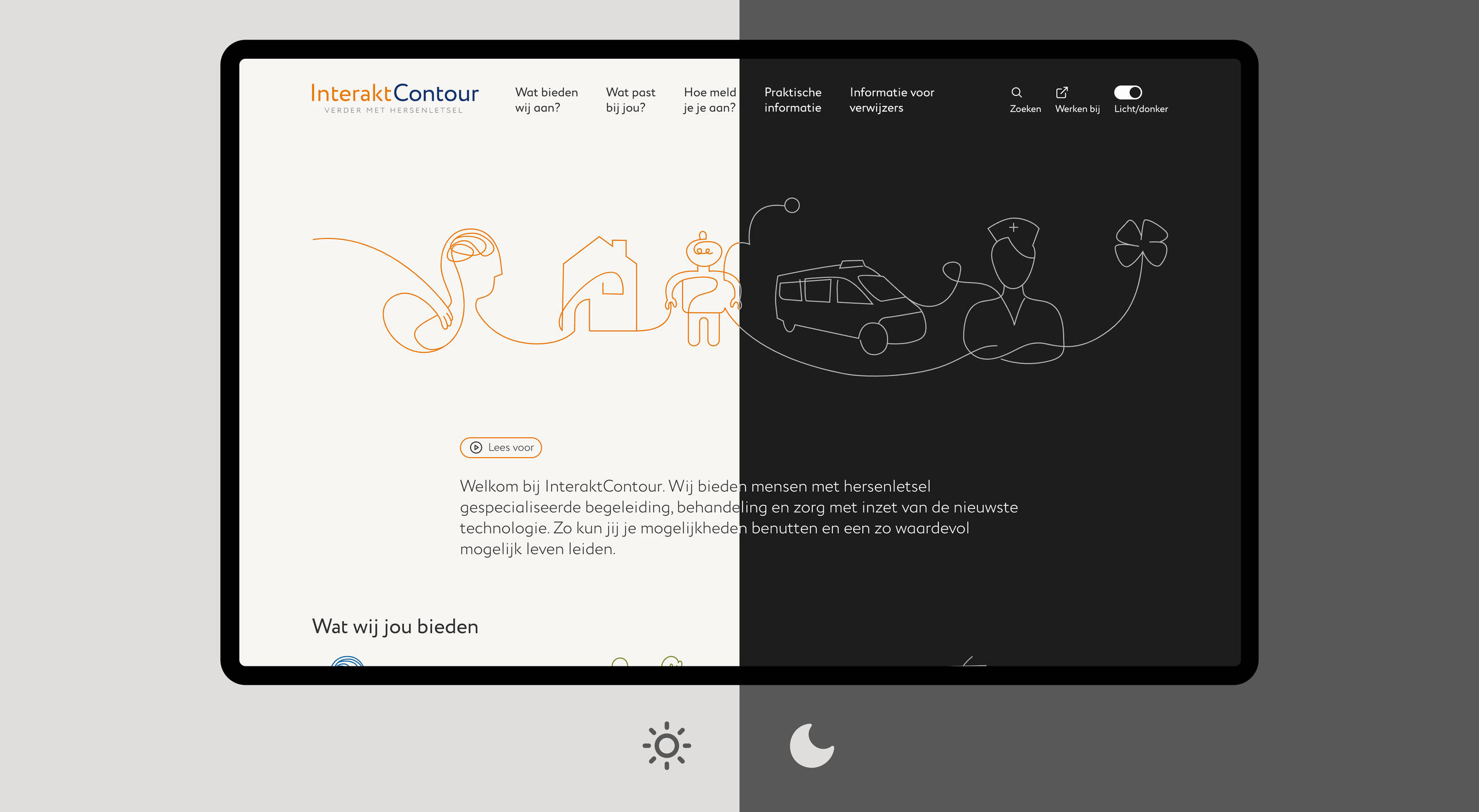
Dark mode is another of-the-moment UI feature implemented on many websites and digital touchpoints. It offers users an alternative visual experience by switching the interface to a darker color scheme, enhancing readability in low-light conditions and reducing eye strain. Some might even claim that dark mode on certain displays uses less energy, creating a sustainability benefit. But to me, it has always felt like a novel modern aesthetic that was specifically designed by and for designers, with the accessibility benefits often overstated to justify its implementation.
When we included dark mode for a website for InteraktContour, the contrary appeared to be true. InteraktContour is a healthcare organization in the Netherlands specializing in providing care and support for individuals with non-congenital brain injuries. After implementing dark mode on their website, we discovered it was popular among users—not for its sleek look, but for its ability to provide a low-stimuli environment that benefits those with brain injuries. It decreases visual stimuli, making it easier for users to focus and engage with content without becoming overwhelmed or fatigued. This underscores once more that accessibility features, like dark mode, serve a broader audience than initially anticipated, highlighting the importance of designing digital environments that accommodate a wide range of abilities and preferences.
Gimmick for Good
So, the simple mode hype might actually help us advance here. The trendy nature of accessibility features and the accompanying aesthetics help frame them as something exciting rather than a design concession to facilitate the disabled. By offering all options to all audiences, we empower everyone to tailor their digital environments as they see fit, turning what might seem like a gimmick into a force for good.