Insights from usability testing with visually impaired users
At Fabrique, we design inclusively. This means we try to make our products better for everyone by taking into account some basic usability principles. Since we also like learning and understand that inclusive design is easier said than done, we organized a usability test with visually impaired users to see how we can improve. In this blog post, I will share our insights.
Setting up the test
Once we decided we wanted to organize this test, we immediately encountered our first challenge. Usually, we hire a recruitment agency to find respondents for the usability tests we organize. This time we needed a different approach. We thought it would be quite hard to find respondents with a visual impairment, but as it turned out we had six people in our network willing to help us with testing in no time!
The people joining the test had a mix of all three levels of visual impairment. In the Netherlands the following guidelines are generally used to describe somebody's level of visual impairment:
- Visually impaired: < 30% sight or a field of sight of < 30 degrees, which cannot be corrected by wearing glasses or lenses.
- ‘Socially’ blind: < 5% sight or a field of sight of < 10 degrees. These people are able to see light and dark and silhouettes of people and objects.
- Blind: 0% sight, also not able to see light.
To be able to use websites or apps, visually impaired users often use tooling with personal settings. So, in order to test our projects realistically, we asked all six respondents to bring their own device(s).
In short:
- 6 respondents with different levels of visual impairment
- 6 projects
- 15 developers and designers
- Each project tested with 3 respondents
- 30 minutes per test
Our insights
1. DIY is easy
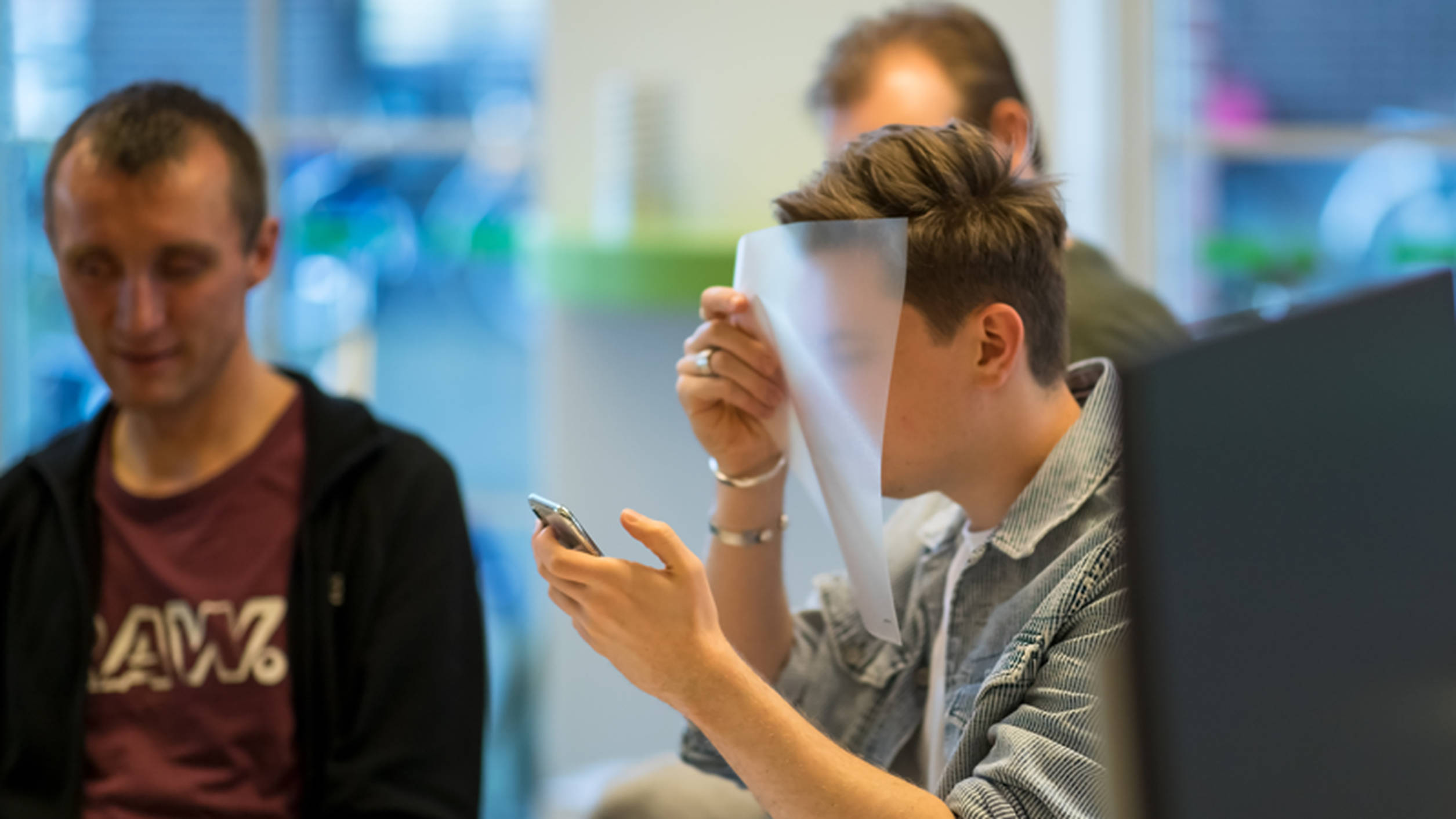
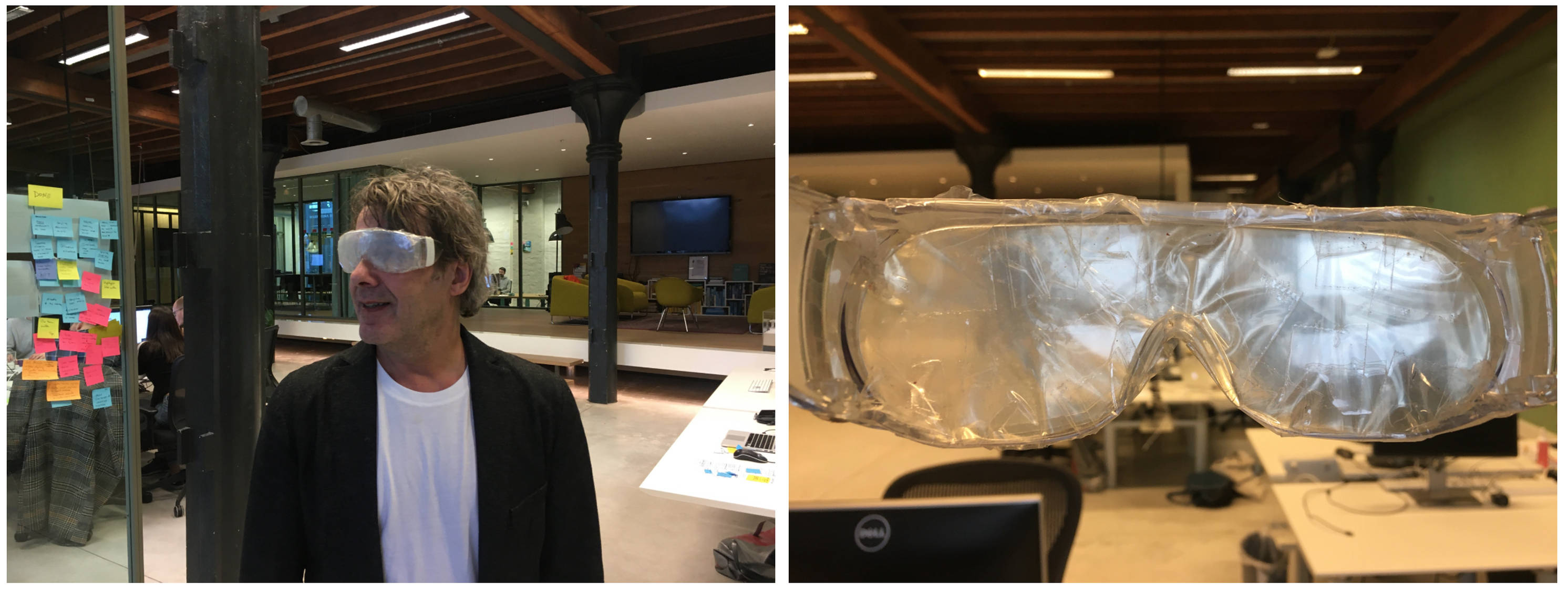
One of the test’s most powerful and revealing insights came from a simple plastic folder. One of the respondents could only see about 2–8% and he wanted to help us experience how he sees the world. The act of putting the folder in front of your eyes to degrade vision. Another respondent brought taped glasses to demonstrate what he sees. There are so many everyday objects lying around that can help you prototype/approximate disabilities. Do it yourself!
2. Visual impairment is not one thing
We already knew from previous usability tests that users can amaze us with all the different ways they interact with a product. So I don’t know why we thought it would be different this time 😅
All respondents handled our websites and apps differently. And besides that they also used different kinds of tooling. Some used screen readers like JAWS, VoiceOver or TalkBack. Some respondents zoomed often. Some looked at their screen to get a sense of what was happening and some not at all. It was super useful to learn about all these different ways of working.
3. Zooming and zoom-in
The respondents with some form of sight used different ways of zooming to be able to see or read the information on the screen. As it turned out, there are many ways to zoom!
We didn’t know there are so many ways to zoom
On mobile, some used the browser setting to zoom, some pinch-zoomed into different parts of the interface, some used the Accessibility Magnifier functionality of iOS or Android and others used a ‘larger text’ setting. On a laptop, some used the browser setting to zoom, some used tooling like ZoomText.
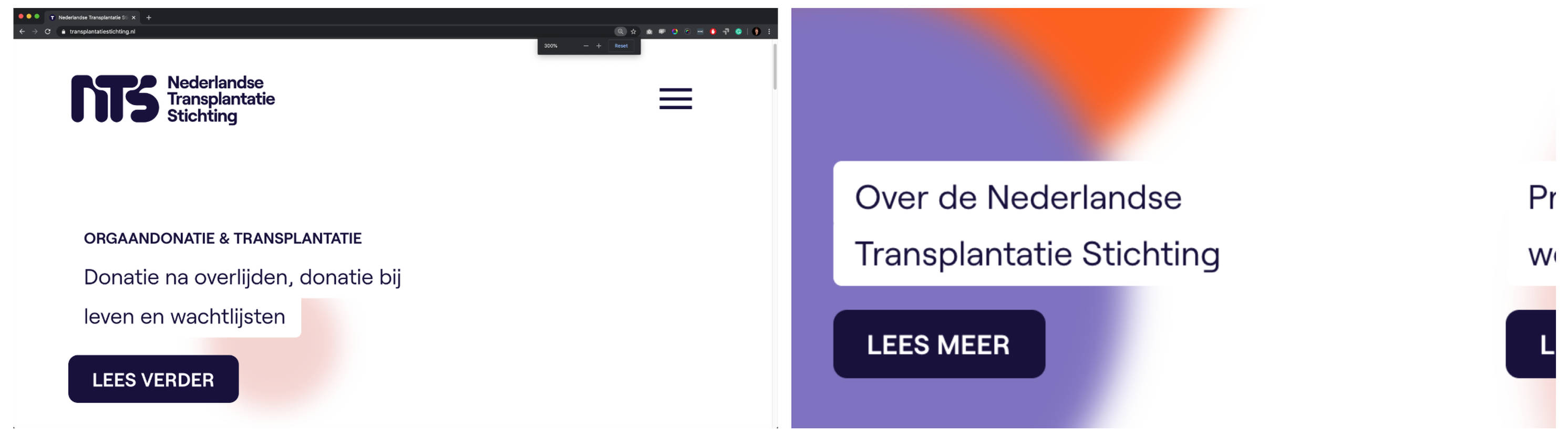
What we learned is that with browser zoom our website may snap to a very usable mobile version, but not all users do this. For example, users exploring the Netherlands Transplant Foundation’s (NTS) website with a screen reader or browser zoom easily found their way. But those who used an interface zoom lost their way because the site shows bits and pieces of information spread out over the homepage.
Other takeaways:
- Always allow for zooming into your interface — never block the zoom level
- Design for adjustable font sizes on web and app — your interface shouldn’t break with a larger font setting
4. The power of innovation
Some designers and developers in the field may feel that having to take disabilities into account limits innovation. But history shows us differently. Did you know that one of the first typewriters was created in 1808 to enable a blind woman to write legible love letters?!
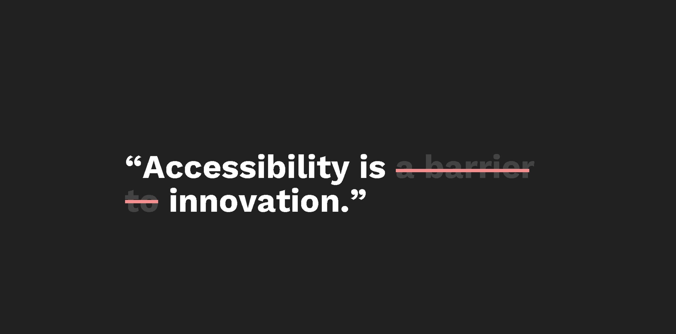
Our respondents helped us understand that designing for accessibility could open all sorts of opportunities for innovation in relatively new technologies.
For example, the respondents often mention how useful voice assistants like Siri and Alexa are in daily life. Being blind or visually impaired means everyday tasks like doing groceries, cooking or planning a train trip can be exhausting. Siri or Alexa on your phone or as a home assistant can help take away the visual strain. This got us thinking about more relevant voice services — more on that later!
The same goes for AI. Respondents use the app Seeing AI to read physical lettering out loud — like product names while doing groceries, paper mail or explanatory text signs next to artworks in a museum.
5. Navigation
Efficiency in working with a screen reader is a big deal. To help users understand your website quickly, make sure your site navigation is consistent throughout the website. The respondents tended to go through the menu structure once to understand the basic structure of the site and then memorize it. On other pages, they would skip the navigation to find information as quickly as possible. We discovered that the expectation always is menu > submenu > content. Keeping things simple is the advice we got over and over. And let’s be honest everybody — visually impaired or not — would like that!
6. Change is hard
One app we tested had restructured many of its elements compared to an older version and this change provoked a lot of comments. It wasn’t because the new app was bad, it was just the simple fact that change is hard. All users, but users with a visual impairment especially, memorize an app’s structure and feel lost when new things feel completely different. Of course, sometimes (big) changes are needed to move forward, but we will be more thoughtful about changing an entire app structure in the future.
7. Interacting with a mobile screen reader: swipe or drag
We also discovered how users navigate with a screen reader on mobile. There are two possible ways to interact with the interface. One is swiping left or right to move from one element to the next. The other is dragging your finger over the screen to read aloud the information you’re touching.
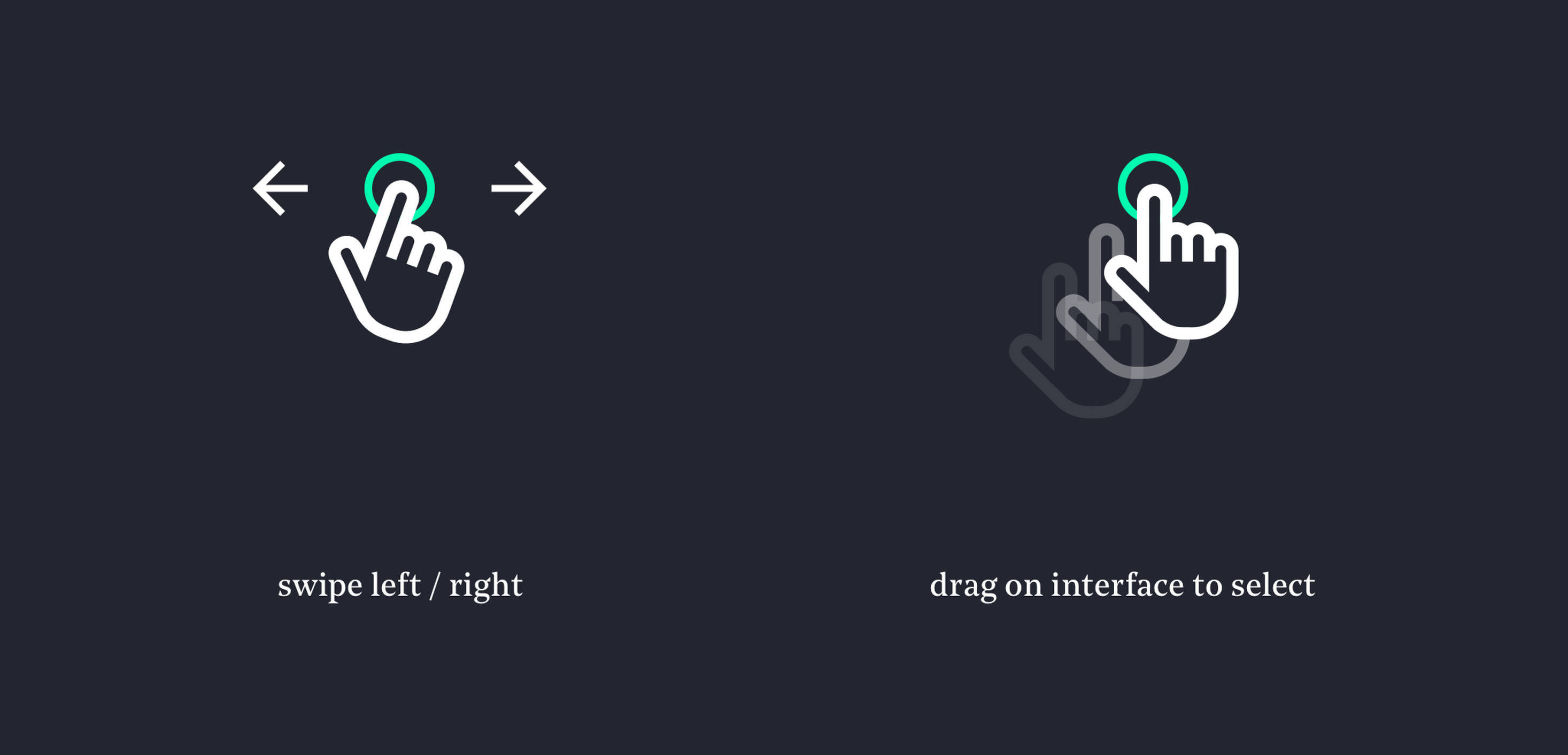
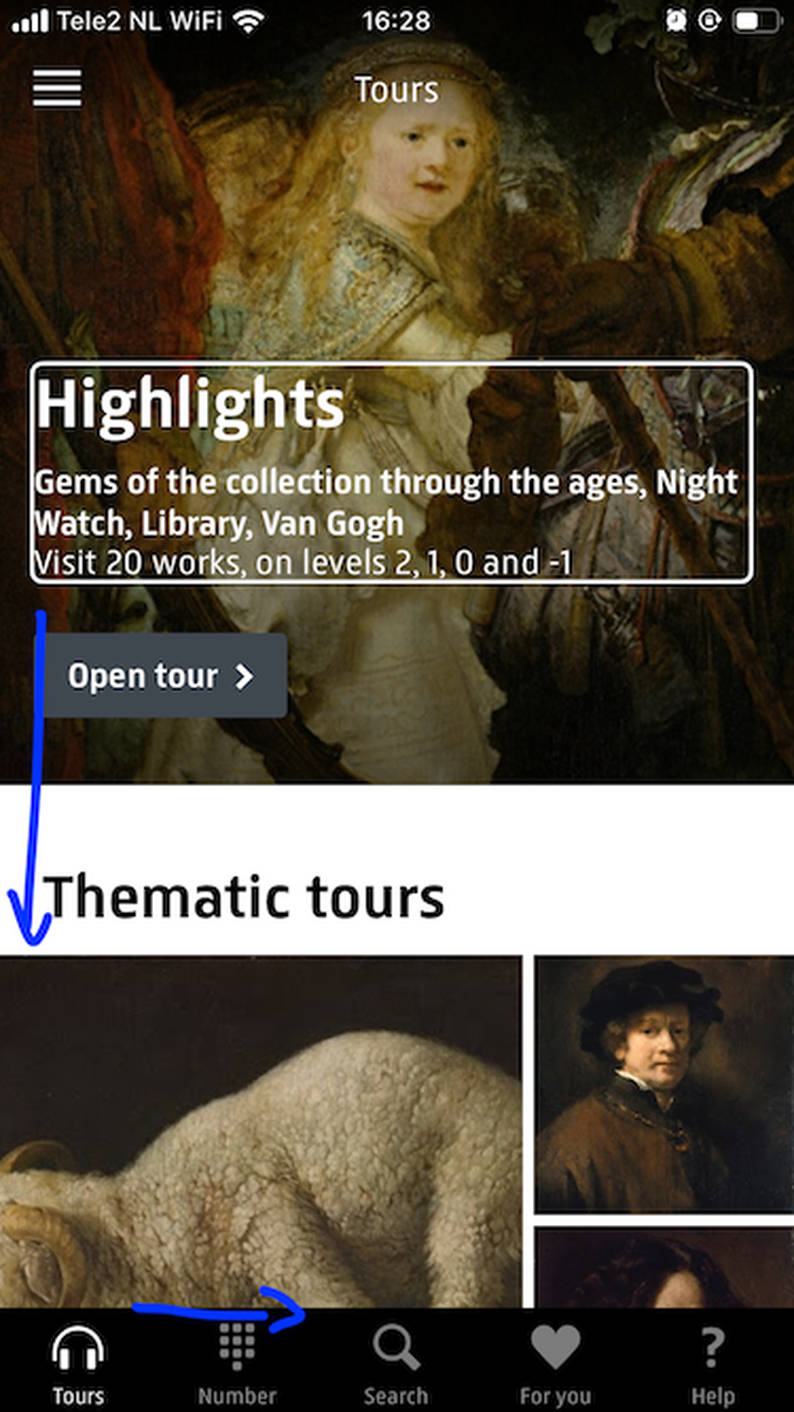
In the swiping left / right interaction, we discovered that long overview pages in the Rijksmuseum app force users to listen to the information being read from top to bottom on the page before getting to the navigation below. This means it is quite difficult for people using screen readers to get a sense of the app's possibilities. The difficulty when swiping arises when the screen reader reads aloud all the information on the page from top to bottom first, before going through the bottom navigation from left to right.
This kind of exclusive design can be avoided by minimizing the length of pages in your app. But it also got us thinking about a different solution 💡. What if we introduce a ‘skip to navigation’ functionality on mobile apps, just like websites often have a ‘skip to content’ functionality when navigated with a screen reader?
8. More screen-readers insights
Screen readers are quite dumb. They read information out loud step by step. We tried to outsmart screen readers by letting them skip descriptive images. This turned out to be really unhelpful. Users that are not fully blind will still see an image and when the screen reader skips these images, users will assume they missed out on information. Solution: let the screen reader tell the users it’s a descriptive image. Or even better, write a descriptive alt-text for images.
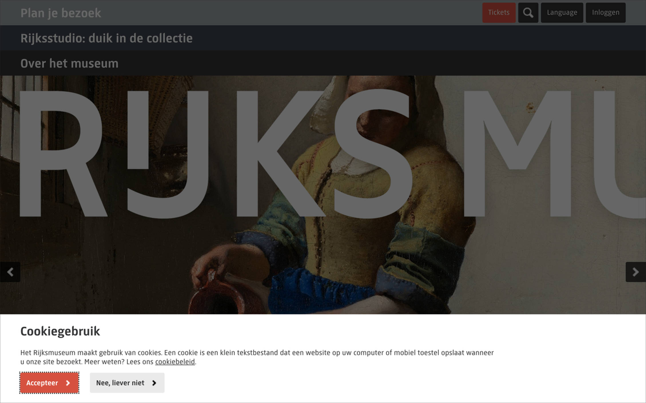
Another insight was that cookie messages, when not implemented correctly, really mess up the interaction with a screen reader. When you use an overlay for the cookie message, you should make sure the first item on the page the screen reader accesses is the cookie bar. An example of a website where this is done right is Rijksmuseum. With the Rijksmuseum cookie bar, users did not encounter any problems.
9. Dark mode
Bright light can negatively influence vision. Many of the respondents prefer to read white text on a dark background because it is easier on the eyes. There are many ways to do this, for example: use dark mode as a setting on your iOS device. But then the app needs to have a dark mode option as well. Since not many apps have this, you can invert all colours by using the invert-colours accessibility feature on your mobile device. The only downside of this is that images are also often inverted, which makes it impossible to see what’s going on in the image.
Ways to help: give your app a dark mode option or build a dark mode functionality into your website (like nu.nl) ☼
10. Test test test
We were blown away by how many potential improvements we found and how much we learned from testing with just 6 people. In addition to our regular usability tests, we definitely want to increase testing with different types of users. There is no one-fix-fits-all approach. There are always insights you couldn’t have imagined beforehand and you can only discover these by testing with real people. As it turned out, six people were really happy to spend their time helping us. And most important of all: we didn’t only gain new knowledge , we also had a lot of fun!
Thanks 👏
We organised this test together with our friends at Q42 — a development agency just around the corner from our Fabrique Amsterdam office. A special thanks to Johan Huijkman for his contagious enthusiasm and knowledge on this topic, and to Maurice for sharing his pictures! Johan also shared his experiences (in Dutch).
I also want to thank all the respondents for their time, enthusiasm, critical observations, feedback, and patience to teach us.
Special thanks as well to Cathelijne Denekamp-van den Berg — Accessibility/Inclusion Manager at Rijksmuseum for getting us in touch with her network.
Hi there. I’m Wendy Steffens, a UX designer at Fabrique digital agency. I truly believe everybody plays a role in the journey towards a more inclusive web. What’s yours? Let me know via wendys@fabrique.nl